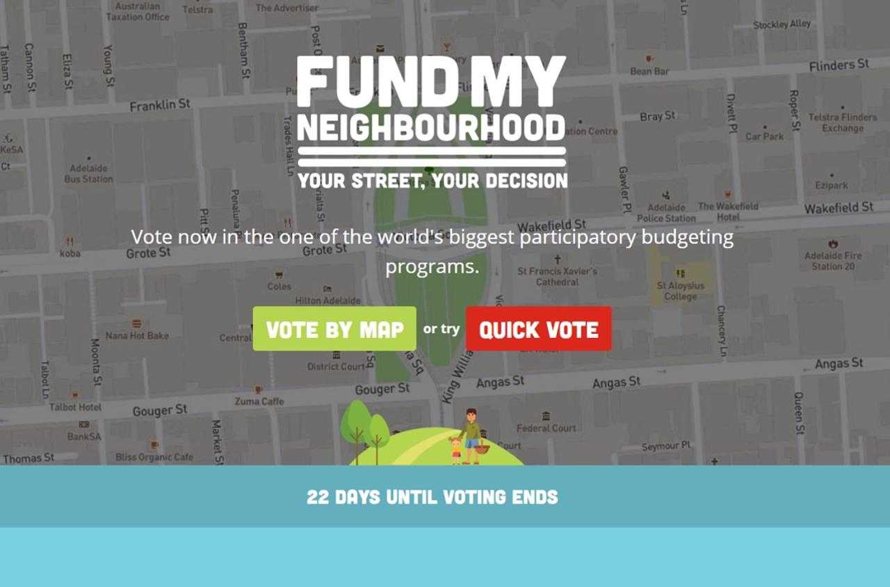
Fund My Neighbourhood
Fund My Neighbourhood engaged South Australians to allocate $20 million dollars in public funds to community projects
Fund My Neighbourhood is the decision and initiatives engagement website developed by Katalyst Interactive for the South Australian Department of Premier and Cabinet (DPC). In 2017, South Australians allocated $20 million of public money through Fund My Neighbourhood. More than 2,500 applications were received and almost 122,000 votes cast. Notably, two-thirds of users who started the voting process finished, demonstrating the effectiveness of high-quality user design.
The Challenge
The challenge was to engage with South Australians to decide how to allocated $20 million dollars of public money. This was done through participatory budgeting (PB), a process of democratic deliberation and decision-making, in which locals submit improvement projects to receive government funding in their area. The community then votes on which projects the government should fund. Winning submissions are allocated public funds.
The Fund My Neighbourhood website needed to be an online voting tool that allowed people to vote for projects in their local area, that couldn’t be exploited, and would provide equal opportunity to influence the results of the program to everybody in the state including regional areas. The voting experience needed to be simple enough and achieve wide participation. It also needed to preserve the integrity of the program and encourage people to carefully consider how the grant money was spent. Most importantly, all voting data had to be secure and accurate.
Voting needed to be quick and easy to ensure wide participation. But the integrity of the program was also crucial, and needed to encourage people to carefully consider how the grant money was spent - this is a key aspect of Participatory Budgeting. Most importantly, all voting data had to be secure and accurate.
The Solution
Katalyst Interactive has developed deep knowledge and experience over many years of working with DPC on community engagement projects including SA Plan and YourSAy. Building on the learnings from previous experiences, the Fund My Neighbourhood website was custom built specifically to meet the objectives and needs of the program.
Forms and workflows designed for purpose
Custom forms and workflows were designed to assist with the efficiency of running such a wide-reaching program. During the application phase, users were able to view their project submissions in a ‘preview’ mode, which offered crucial insight for applicants who would not have known what to expect from a first time grant program. Eligible projects then automatically flowed through to the public voting phase.
Voting integrity and security
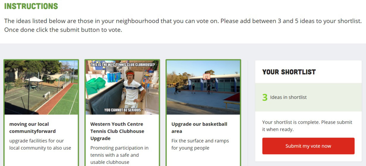
During the voting phase, user prompts assisted voters through the voting process. This maintained the integrity of the process by not oversimplifying the system, while at the same time making it as user-friendly as possible to involve a diverse range of people in the decision-making process. Two factor authentication, primarily through text message, was introduced to stop people voting more than once, and people were required to support between 3 and 5 projects.
User journey development
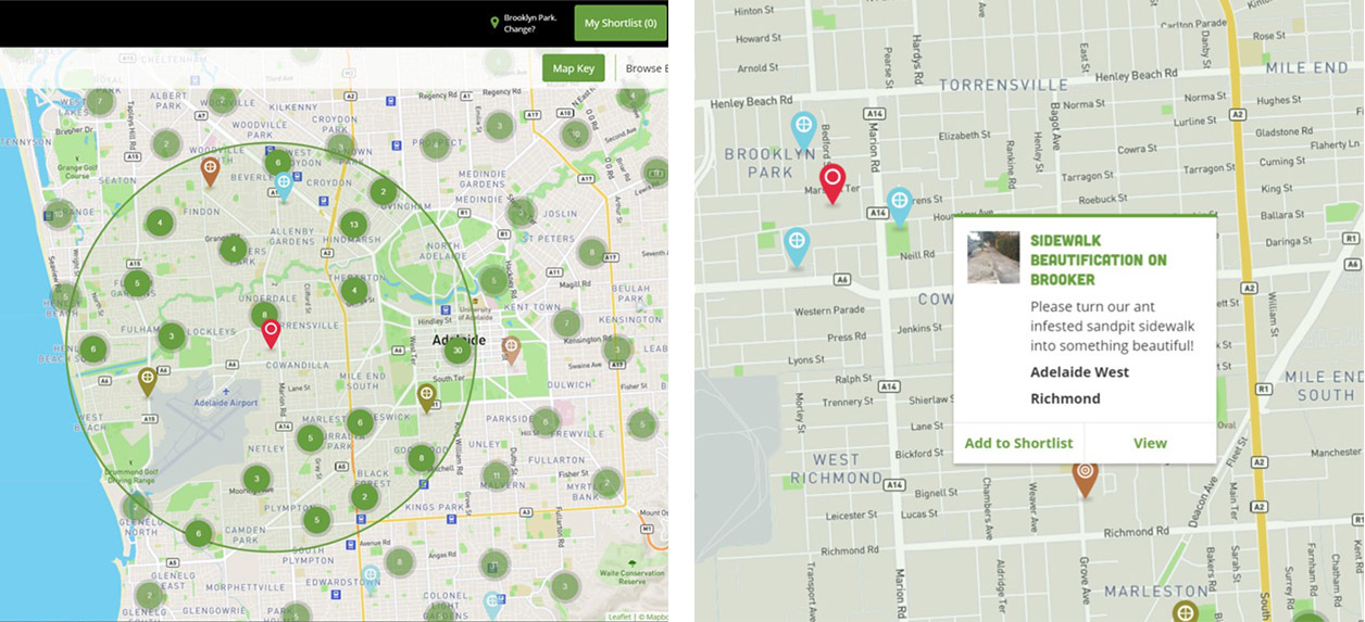
Two distinct voting journeys were created, providing a clear and robust user experience. A ‘smart map’ restricted users to vote for projects within 5km of where they lived. In regional areas with lower populations, this distance expanded to display at least 30 projects.
A map view allowed users to easily locate projects in their neighbourhood, via pins centred on their address. A quick-vote journey displayed all projects in a list, ordered by proximity to the voter’s address. Voters saved their preferred projects in a shortlist before ultimately deciding which projects to vote for
Scalable architecture
With an extraordinary response to the initiative, Fund My Neighbourhood website received unanticipated load from thousands of users surging to the website. This was quickly detected with an immediate response from Katalyst engineers to upsize to a cluster configuration in the cloud. This was delivered within hours. The cluster configuration allows the website to increase or decrease capacity to meet the needs of each phase of the initiative.
Data analysis
Data about voting and demographics were collected in each phase of the initiative and organised into relationships that allowed data to be summaries by categories for analysis. The DPC team used this data to determine regions and demographics where there was limited engagement. They could then target marketing to specific demographics as well engage with regions who were not using the voting platform.
Transparency through project dashboards
Each idea successful project had a dashboard that linked multiple stakeholders to the project where they could review the progress of the project as it was delivered.
Encouraging promotion through community and social networks
The website provided downloadable collateral packs that allowed the community to create their own promotional flyers to rally locals around their ideas. Additionally the website has share features that post projects and updates through to social networks. This helped to grow awareness of this initiative by leveraging users social networks.
Integration strategy to grow community participation
The Fund My Neighbourhood website was integrated into the SA government's engagement portal YourSay so that users who already had a YourSAy would use the same login for Fund My Neighbourhood. Additionally users who registered for Fund My Neighbourhood could now also participate on other YourSAy initiatives. In this way the government was looking to grow community engagement across all their initiatives following an introduction through the Fund My Neighbourhood program.
The Outcome
In 2017, South Australians allocated $20 million of public money through Fund My Neighbourhood. More than 2,500 applications were received, and more than 33,000 South Australians cast almost 122,000 votes. The program had significant social impact, successfully motivating many people to participate in improving their communities.
Around 130,000 people visited the website during the program’s voting period, suggesting an impressive 25% conversion rate from ‘visitor’ to ‘voter’. Notably, two-thirds of users who started the voting process finished, demonstrating the effectiveness of high-quality user design. 204 projects were funded, including improvements to parks, playgrounds, sporting facilities, environment and arts projects.
Highlights
- 25% conversion rate from visitor into voter and 122,000 votes cast
- More than 2,500 idea applications submitted
- $20 million public funds allocated
- Good Design Awards: Winner best in class
